

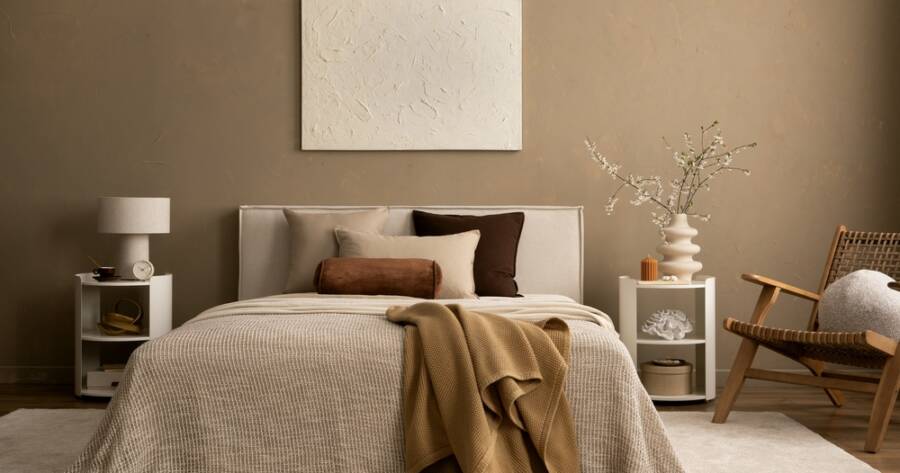
Beige dominated interiors for years, but 2026 paint forecasts from major brands signal a decisive shift toward deeper, more expressive wall colors. There are many popular color choices, ranging from rich earth tones to smoky jewel hues, that bring personality and warmth to modern spaces.
Why the Industry Is Moving Beyond Beige
The safe, washed-out neutrals that defined interior paint choices for much of the past decade are giving way to something bolder. Color forecasters at leading paint brands have converged on a shared vision for 2026: walls that communicate mood, ground a room in natural warmth, and reward careful attention to color relationships. Across multiple brand palettes, the direction is clear—trending hues are pulling away from cold, digitally inspired tones and moving firmly toward rustic browns, sprouting greens, and earthbound materials (source).
This shift reflects a broader cultural appetite for spaces that feel genuinely inhabited rather than staged. Homeowners and designers alike are gravitating toward colors that offer emotional resonance, whether that means a library-dark accent wall, a hazy sage in a dining room, or a deeply saturated front door that stops visitors in their tracks.
Benjamin Moore’s Silhouette: Sharp Enough to Stand Alone
Benjamin Moore named Silhouette AF-655 as its 2026 Color of the Year, a hue that blends the warmth of burnt umber with the quieter depth of charcoal (source). It occupies a compelling middle ground—dark enough to make a deliberate statement yet refined enough to serve as a sophisticated neutral in the right space. According to Benjamin Moore’s color marketing director Andrea Magno, Silhouette is “too sharp to be a mere neutral,” evoking the appeal of structured style paired with underlying comfort (source).
Silhouette does not stand alone in Benjamin Moore’s broader 2026 palette. The Color Trends 2026 collection pairs this grounded anchor with a range of companions—from the airy softness of Raindance to the terracotta warmth of Southwest Pottery—creating a system that balances deep tones against delicate ones (source). The palette is designed so each color carries its own presence but also participates in layered, multi-room color stories that feel considered rather than accidental.
PPG’s Warm Mahogany and the Rise of Bold Reds
PPG Paints chose a strikingly different but equally intentional direction for 2026, naming Warm Mahogany as its Color of the Year. The brand describes it as “a rich, grounded red that’s bold enough to draw immediate attention and reserved enough to make a timeless statement” (source). Unlike the loud, primary reds that tend to overwhelm a room, Warm Mahogany carries enough brown and earthy depth to function in everything from a study to a formal dining space.
PPG organizes its 2026 forecast into four distinct palettes. The Heirloom palette draws on the visual language of academic interiors, historic brownstones, and well-worn library stacks, projecting a sense of established refinement (source). Meanwhile, the Ode palette leans into jewel-toned opulence layered with mineral undertones, evoking a romantic and poetic atmosphere that works beautifully in residential rooms seeking subtle drama (source). Together, these palettes illustrate how deeply saturated colors can serve very different stylistic narratives depending on how they are deployed.
Behr’s Hidden Gem and the Smoky Green Moment
On the cooler end of the 2026 spectrum, Behr selected Hidden Gem—a smoky jade tone—as its Color of the Year. The color is described as offering “comfort, clarity, and a strong sense of place,” and it performs particularly well on kitchen cabinetry or when used to wrap an entire room in a sense of calm enclosure (source). Hidden Gem reflects a wider appetite for greens in 2026, a tone family that appears across multiple brand forecasts in varying levels of saturation and warmth.
Smoky greens occupy a particularly useful design space. They read as organic and nature-derived without tipping into the overly literal territory of a full botanical palette. On cabinetry, a color like Hidden Gem can replace the now-familiar navy or black as a sophisticated alternative; on walls, it creates the kind of immersive atmosphere that feels both current and enduring.
How to Layer 2026 Colors Throughout a Home
One of the consistent themes across 2026 color forecasts is the importance of intentional layering. Benjamin Moore notes that the colors in its 2026 palette are built to work both as standalone statements and as components of more complex, room-to-room color relationships (source). PPG echoes this in its Portal palette, which encourages pairing grounded base tones with lively accents used sparingly to introduce bursts of energy without disrupting overall coherence (source).
In practical terms, this means a home might anchor its main living areas in a warm midtone like Silhouette or Warm Mahogany, then allow adjacent spaces to breathe with something lighter—perhaps a pale from Benjamin Moore’s Raindance or First Crush. The key is treating color as a connected sequence rather than a series of isolated decisions. When each room references the adjacent palette, transitions feel natural and the overall effect reads as sophisticated design rather than patchwork experimentation.
Pantone’s 2026 offering, Cloud Dancer, represents another layer in this ecosystem—an airy, uplifting white with balanced warm and cool undertones that designers are positioning as a more inviting alternative to the stark, fluorescent-feeling whites that dominated minimalist interiors in recent years (source). Used on trim, ceilings, or as a whole-room color in a smaller space, Cloud Dancer can serve as the connective tissue that allows bolder wall colors to breathe.
Why 2026 Paint Trends Are Worth Exploring Further
The 2026 paint landscape offers something meaningful for anyone rethinking their interior spaces. Whether the draw is the structured depth of Benjamin Moore’s Silhouette, the grounded confidence of PPG’s Warm Mahogany, or the tranquil clarity of Behr’s Hidden Gem, this year’s forecasts collectively make a strong case for moving past the safety of beige.
Color trends from major brands signal that 2026 is a year to invest in walls that say something—spaces that reflect care, history, and a genuine point of view. Exploring these palettes in depth, testing samples in natural and artificial light, and considering how colors interact across rooms are all worthwhile steps for anyone ready to commit to a more expressive interior.